import pandas as pd
import seaborn as sns
import matplotlib.pyplot as plt
from google.colab import drive
# Mount Google Drive
drive.mount('/content/drive')
# Load the data
file_path = '/content/drive/My Drive/dataset/az_0704.csv'
data = pd.read_csv(file_path)
# Define GDP group names
gdp_group_names = {0: 'Low', 1: 'Lower Middle', 2: 'Middle', 3: 'Upper Middle', 4: 'High'}
# Get unique GDP groups and country names sorted alphabetically
gdp_groups = sorted(data['gdpg1'].unique())
country_names = sorted(data['Country Name'].unique())
# Initialize a list to store individual plots
individual_plots = []
# Plotting scatter plot for each country with az100k over years grouped by GDP groups
countries_per_row = 5
for gdp_group in gdp_groups:
subset = data[data['gdpg1'] == gdp_group]
country_subset_names = sorted(subset['Country Name'].unique())
for i in range(0, len(country_subset_names), countries_per_row):
n_cols = min(countries_per_row, len(country_subset_names) - i)
fig, axes = plt.subplots(1, countries_per_row, figsize=(30, 5))
fig.suptitle(f'Scatter Plot for GDP Group: {gdp_group_names[gdp_group]}', y=1.02)
for j in range(countries_per_row):
if j < n_cols:
country = country_subset_names[i + j]
country_subset = subset[subset['Country Name'] == country]
# Scatter plot with regression lines
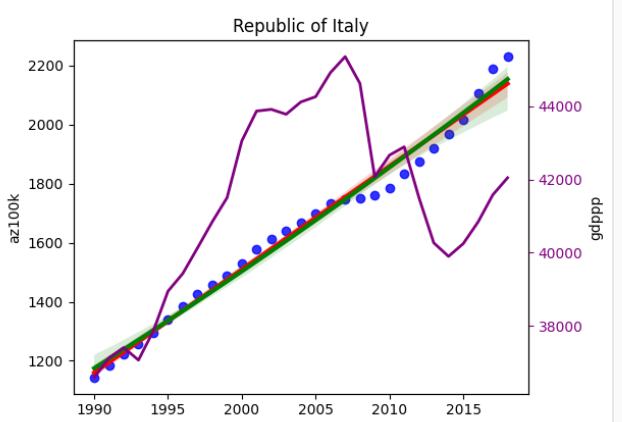
sns.regplot(ax=axes[j], x='year', y='az100k', data=country_subset, scatter_kws={'color': 'blue'}, line_kws={'color': 'red', 'linewidth': 3})
sns.regplot(ax=axes[j], x='year', y='az100k', data=country_subset, scatter=False, order=2, line_kws={'color': 'green', 'linewidth': 3})
axes[j].set_title(f'{country}')
axes[j].set_xlabel('Year')
axes[j].set_ylabel('az100k')
# Create a secondary axis for the line plot
ax2 = axes[j].twinx()
ax2.plot(country_subset['year'], country_subset['gdppp2017'], color='purple', linewidth=2)
ax2.set_ylabel('gdppp')
ax2.tick_params(axis='y', colors='purple')
else:
axes[j].axis('off')
# Adjust layout to make sure all subplots have the same size
plt.tight_layout(rect=[0, 0, 1, 0.95])
plt.show()
# Save individual plots to list
individual_plots.append(fig)
# Combine all individual plots into one large figure
total_plots = len(individual_plots)
plots_per_row = 2
total_rows = (total_plots + plots_per_row - 1) // plots_per_row
fig, axes = plt.subplots(total_rows, plots_per_row, figsize=(30, total_rows * 5))
for i, individual_plot in enumerate(individual_plots):
row = i // plots_per_row
col = i % plots_per_row
axes[row, col].imshow(individual_plot.canvas.buffer_rgba())
axes[row, col].axis('off')
plt.tight_layout()
plt.show()